Our Top Five Power BI Outcomes Dashboards From 2023
/
An important and increasingly in-demand part of our work with our incredible clients here at Clear Horizon is collating and visualising their data into striking and powerful outcomes dashboards. Our goal with these dashboards? Creating accessible insights about an initiative’s impact, using a tool that can empower teams to explore the data and share their outcomes more widely than traditional reporting allows.
This is where the CH secret sauce comes in! We help develop tailored and sophisticated dashboards to change initiatives worldwide, transforming complex data into actionable insights to facilitate the L in MEL – learning.
What is a dashboard?
A dashboard is more than just a tool—it’s an essential instrument that empowers organisations to visualise, analyse, and act on data with precision. Utilising platforms like PowerBI, these dashboards are meticulously designed to transform complex data into a clear, interactive, and aesthetically refined display of charts, graphs, and maps. They provide a comprehensive snapshot of a program’s progress, enabling stakeholders to monitor key performance indicators, compare outcomes against strategic objectives, and extract actionable insights. Dashboards are pivotal in M&E/MEL for fostering informed decision-making and ensuring transparency, allowing organisations to optimise their impact and continuously refine their initiatives through intelligent, data-driven adjustments.
While we don’t usually play favourites (and have loved working on all the outcomes dashboards for our clients), here’s a list of our top 5 dashboards of the past year (in no particular order!).
#1 Barkly – providing transparency and accessibility to communities
About
The Barkly Regional Deal (BRD) is a 10-year, $78.4 million commitment between the Australian Government, the Northern Territory Government and Barkly Regional Council to improve the productivity and liveability of the Barkly region by stimulating economic growth, improving social outcomes, and supporting local Aboriginal leadership.
The Objectives
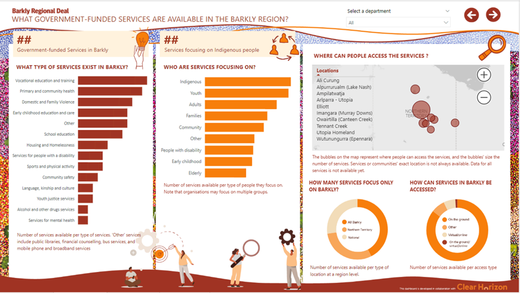
The Government Investment and Service System Reform (GISSR), one of the 28 initiatives under the BRD, sought our support to develop an online-based presentation to share data about services in the region with communities living in the Barkly and across government agencies. The presentation would give a line of sight of funds invested, available services and their delivery mode to help the Barkly community assess, review, and consider they aligned with their needs and how they could be better delivered or reformed. Most importantly, the presentation needed to show information in a context-appropriate way, allowing the community to easily interpret the data and critically review the service system.
The Solution & Process
Consultation, consultation, consultation. Having the community’s voice shape the data presentation was crucial for this project. During a series of consultations, key community members identified the most meaningful and useful data for them. We partnered with Price Waterhouse & Coopers Indigenous Consulting (PIC – majority owned, led and staffed by Indigenous Australians) to engage with the community, local experts, and representatives from the Barkly region.
The result was a Power BI dashboard presenting the priority data community identified. The dashboard will be published on the BDR website, and a printed version will also be available.
Why we love this dashboard:
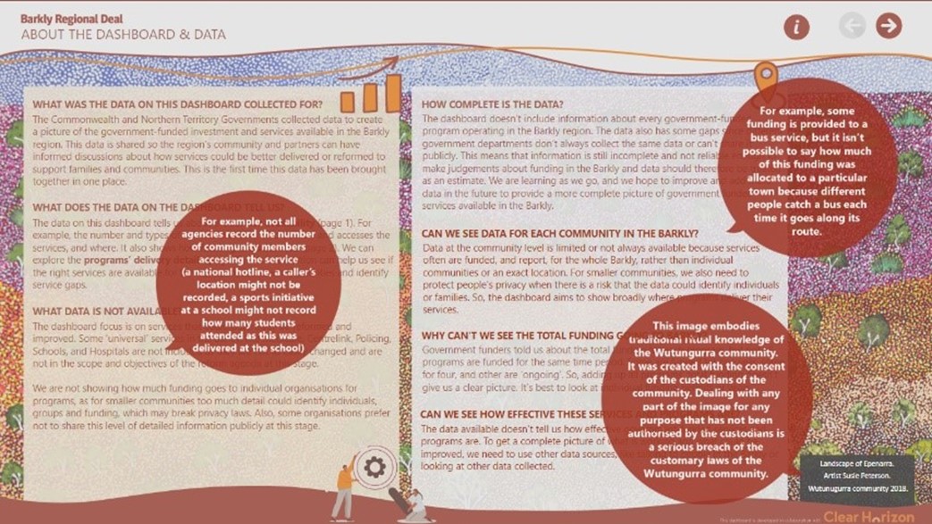
We love this dashboard because of the combination of: project information and introduction, a practical data analytics page, followed by a project research page. In just three pages, this beautiful dashboard (the background designed by Susie Peterson) provides a complete overview of the project.
Additional information available in one click. We love to add more explanations when possible, but they can take up a lot of space! To minimise the text-to-space ratio and keep a readable format we incorporated information icons that provide key explanations when clicked to allow users to read more. This solution allowed us to provide more information without overwhelming the reader.
#2 YMCA – engaging teams in organisational change
About:
YMCA Victoria is a not-for-profit organisation offering a range of programs and services to inspire and empower young people and communities across Victoria. With over 5,000 staff and volunteers working at more than 150 locations, their services include managing recreation centres, organising action sports, running camps, providing children’s programs, and delivering youth services. YMCA Victoria is committed to community involvement and ensuring accessible programs through initiatives like YMCA Open Doors.
The Objectives
YMCA Victoria needed to implement their Social Impact Measurement strategy across many programs and business units. One key element of this implementation was the measurements and monitoring of their social impact in an automated way. Because there was no baseline or put more simply, nothing we could directly compare the data to, context data was required. We also had to consider the impact of COVID-19 on key outcomes such as mental well-being and connection.
The Solution & Process
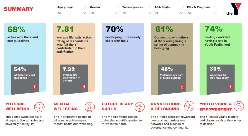
Aggregation and contextualisation. The dashboard aggregates the measures across five outcomes, and allows the users to review one outcome result for the whole organisation or for selected programs. To support contextualising the data collected, we leveraged Victorian population data. At the start of the dashboard, the summary page gives users an overview of how the selected programs are tracking, displaying the measures in green when above the population average and in red when under that average.
From a program to the organisation, The YMCA Victoria social impact team was able to engage teams across the organisation and show how they could participate in the overall organisational impact. Not only does the tool provide transparency and accessibility, it also creates a sense of a common organisational goal for the teams taking part in the process.
Why we love this dashboard:
We love this dashboard because it shows the impact of teams’ effort.This dashboard allows us to understand how one team participates in larger outcomes, while also allowingusers to combine and drill down into the details of those insights (per gender, age, region, etc.). We also love this dashboard because it provides additional context data to help us make sense of the collected information – a huge plus to analyse and make sense of what we see.
#3 Steppingstones- collecting and following the progress of sites
About:
Connected Beginnings is an Australian program to support Aboriginal and Torres Strait Islander children’s early development by enhancing access to health, education, and family support services. Through culturally appropriate, community-led initiatives, the program integrates local services to ensure children are safe, healthy, and school-ready by age five.
The Objectives
The Connected Beginnings program is being implemented nationally across article was written), working with Aboriginal organisations and communities to improve outcomes for children. The program is jointly funded by two federal government departments and is supported by partners, including Ninti One, Collaboration for Impact, Kowa, and Clear Horizon.
Connected Beginnings Sites needed a tool to map their progress in working together and the joining up of services across years. The tool had to be easy to use, access, and understand. It should also reflect each site’s particular ways of working while aligning with the Connected Beginnings UMEL.
The Solution & Process
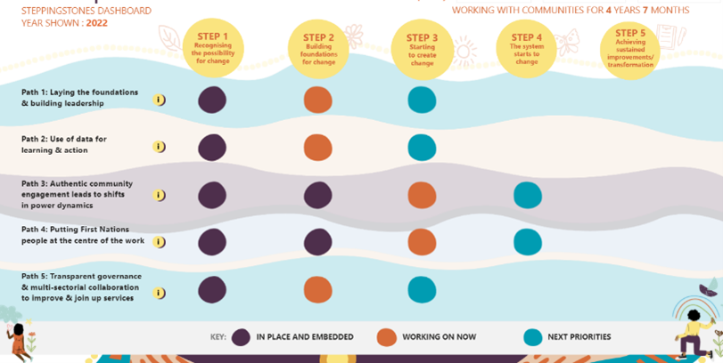
Following the vision of the tool, we developed the Steppingstones, a unique progress mapping rubric for Sites to collect, process, and self-report on local progress made by communities across key areas of the collective approach and implementation. We then translated the tool into a digital dashboard that covers the key conditions/pathways for change around engagement, collaboration, systems leadership, and using data and evidence.
The dashboard shows communities’ progression, the early changes and smaller steps towards service integration (or ‘steppingstones’), and progress ahead of the longer-term changes for families and children. The stones represent what is already achieved or embedded, what sites are working on and what their next working priorities will be.
We developed this unique dashboard using the existing PBI features and adapting them to our vision of the steppingstones tool:
Why we love this dashboard
This dashboard is the tip of the iceberg of a collaboration between many actors. We love this dashboard because it represents this incredible effort of data sharing, coming together and sharing insights in an accessible way. We love the creativity behind those steps and how we can show progress on multiple levels for the communities and other key stakeholders of the project.
#4 Windana – measuring the impact of a program
About:
Windana is a holistic service provider in Victoria that offers evidence-based programs for individuals facing issues with substance abuse, family violence, mental health, and social disadvantages, aiming to rebuild lives through a comprehensive range of residential and community-based treatments, educational support, and advocacy.
The Objectives
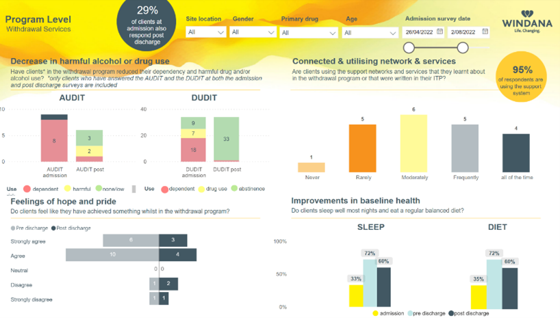
Windana was looking for a dashboard to aggregate in real time the pre- and post- program data about their clients and understand how their programs were making a change to their clients’ lives.
The main challenges for Windana were: how do we show key aggregated indicators before and after our program? How can we make it useful and insightful for our staff?
The Solution & Process
We started the process by agreeing on scores to aggregate a complex set of information into a readable/digestible data point. These scores were based on the Windana and the sector’s guidelines. Once those scores were confirmed and calculated, we leveraged the initial wireframes from the dashboard to create an explorative tool that could both drill down at an individual level and show the impact of the program at the higher level. The result was a two-page dashboard with both individual and aggregated view on the pre and post programs score.
Explorative tool.
“At any time, a Windana program can now learn how their therapeutic services are working. At every quarter, Windana staff review the results of the last three months and see the value they make in others’ lives as well as setting a new goal for the next quarter. This approach means that they are empowered to improve the effectiveness of their work year after year. This is a wonderful step forward to the future of healthcare.”
Why we love this dashboard
We love this dashboard because it is a simple and elegant way to show how to visualise the impact of a program on a group. It provides a diverse range of charts, giving us different ways to analyse the data.
#5 IWDA – exploring advanced analytics for all
About:
IWDA is an Australian organisation dedicated to advancing gender equality by resourcing and empowering women’s rights organisations in Asia and the Pacific. For over 35 years, IWDA has supported the development of feminist movements, combining advocacy, knowledge creation, and strategic partnerships to transform systemic inequalities and promote sustainable change towards gender equity.
The Objectives
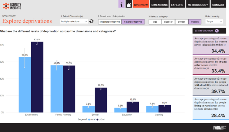
IWDA needed to develop a public-facing dashboard to share more advanced insights about deprivations across fifteen dimensions. These insights included statistical analysis to share with audiences that might not be familiar with the best way to interpret those. Exploring the information across the fifteen dimensions, as well as their subdimensions, could easily be overwhelming. Refining the users’ journey was as critical as the data itself.
The Solution & Process
Conceived as an explorative tool. The Clear Horizon team developed a multi-layer filtering design to allow in-depth exploration of the data main available. The user follows intuitive steps – selecting the country, the dimension(s), the level of deprivation, etc. – to find the information they are interested in. On top of that, an overview of the aggregated data is also made available.
Where statistics meets data visualisation. Confidence intervals were added to the bar charts when possible to integrate the margin errors of data points as part of the visualisations. Correlations across deprivations were displayed using tables and conditional formatting, updating when a new dimension was selected.
Why we love this dashboard
We love this dashboard because of the balance found between sharing complex insights and empowering the users exploring it. In providing 15 pages for each dimension, additional filtering for years, countries, subdimensions and more, we give every stakeholder full access and transparency to the data without overwhelming them.
Don’t get held back by outdated reporting
Dashboards, particularly in Monitoring and Evaluation (M&E) and Monitoring, Evaluation, and Learning (MEL), replace or significantly improve traditional reporting and data analysis methods. Here are a few of our favourite benefits of dashboards:
- Efficiency in reporting: Dashboards streamline the reporting process by replacing static, time-consuming reports (such as spreadsheets and written documents) with dynamic, interactive visualisations. This allows for real-time data updates and instant access to crucial information, dramatically reducing the time needed to compile and interpret data.
- Data accessibility: Traditional methods often require navigating complex data sets or multiple reports to extract relevant information. Dashboards consolidate all critical data into a single, easily navigable interface, enhancing accessibility and comprehension for all stakeholders.
- Decision-making speed: By providing a clear, concise view of key performance indicators and trends, dashboards enable quicker, more informed decision-making compared to older methods that require manual data synthesis and analysis.
- Enhanced Collaboration: Dashboards facilitate better communication and collaboration across teams by providing a common platform for data sharing. This unified view ensures that all stakeholders are informed and can discuss strategies based on the same set of data.
- Scalability and customisation: Unlike static reports, dashboards are scalable and can be customised to meet the evolving needs of an organisation. They can be adjusted to focus on different data sets, adapt to various projects, or highlight new KPIs as organisational priorities change.
Overall, dashboards not only replace outdated reporting techniques but offer a more sophisticated, reliable, and user-friendly approach to data handling in M&E and MEL frameworks. This shift improves operational efficiency and enhances strategic insight, driving better outcomes for programs and projects.
Ready for your own data tool this year?
If these examples inspire you and you would like to learn more about what implementing a dashboard within your organisation can look like, don’t hesitate to start a conversation with us. Our team offers a wide range of digital solutions to help your organisation measure its impact using data-driven and automated tools.
No matter where you are in the process of a dashboard, our team can help you assess how and when to best approach it. We have experience in offering advanced dashboards (with automated qualitative analysis, advanced visualisations and accesses, etc.) or basic dashboards to help you start your insights journey. Our priority is to find a solution that fits your needs and can follow and report the journey your organisation is on.


